
Results interpretation guide after calculation
Once your project is complete, this step allows you to explore and analyze the results. You can view performance indicators directly on the map and in a summary table, making it easier to evaluate the results of your tested sites.
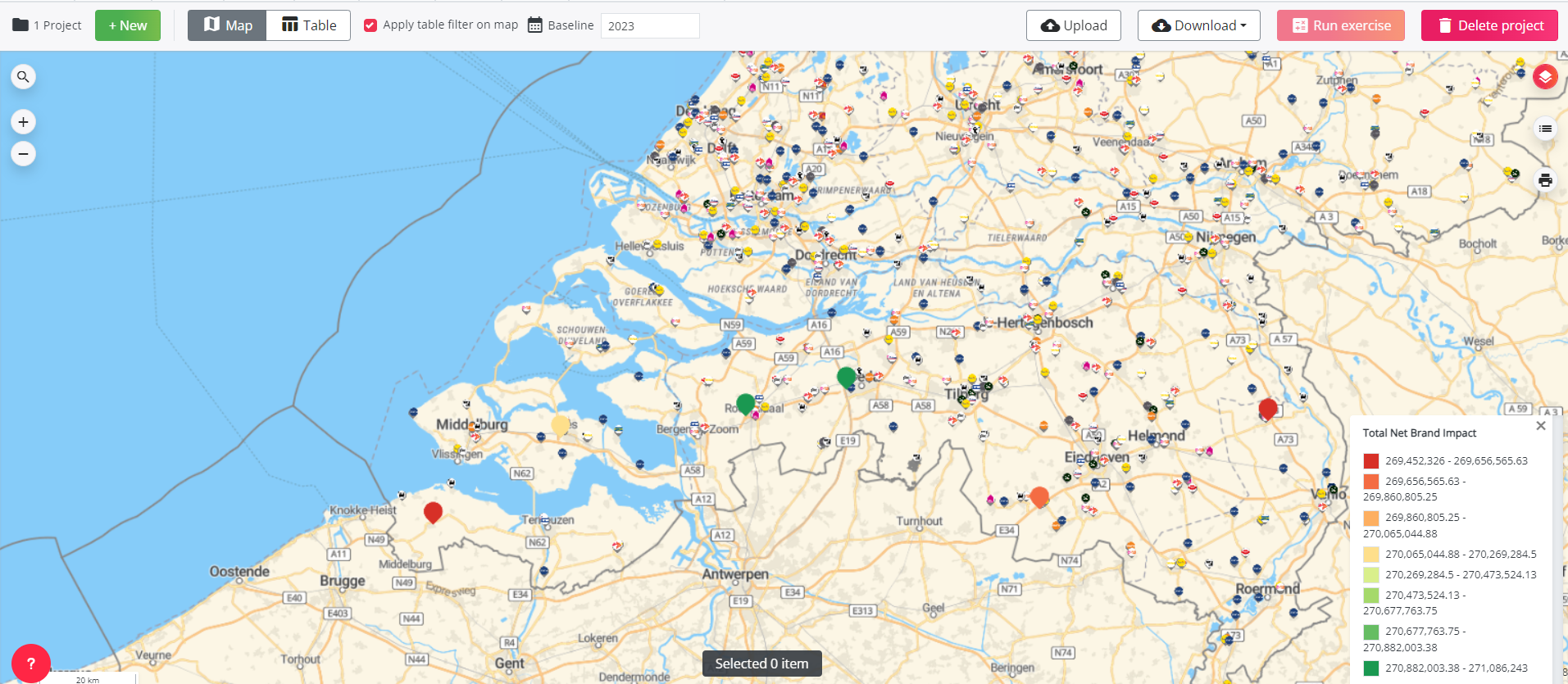
The map provides a visual overview of the relative impact of each site, allowing you to quickly identify the most and least promising sites. The table provides detailed indicators that have been calculated by the model, providing you with all the information you need to make your decision.
On the Map
The map shows each location in colour, from red to green. This represents the net impact of a location on the network as a whole. Red locations have a low net impact, while green locations have a high net impact.
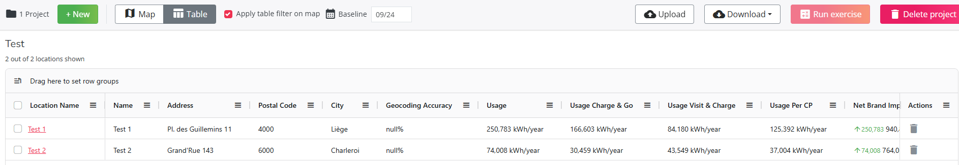
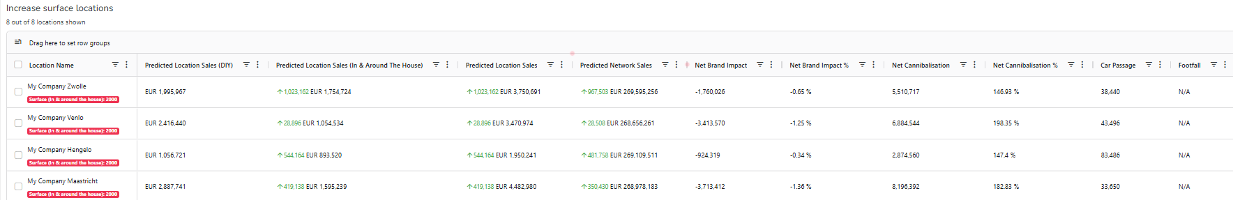
In the Table
You will see results for each locations in the list as well as extra context informations:
- Usage (global and per segment)
- Impact on the brand
- Characteristics of the sites you loaded
- Local Activity per type
- Car passage
- Competition per type and traveltimes
- Developable public slow charging power
If you want more precisions on each column you can refer to this article
Because our model works with travel times to calculate predictions, locations located in a large parking may lead to poor results. If this is the case, we recommend updating the traveltimes by selecting a road segment close to the entrance of the parking. This will lead to a more accurate result. This can be done in next step